
Disclaimer: This article is more than two years old. Developments in science and computing happen quickly, and more up-to-date resources on this topic may be available.
Visualization tools such as LLNL’s VisIt offer many important capabilities, one of which is imbuing data with color. This can be thought of as virtually painting color onto a data object to communicate something about the data to viewers. In the case of a visualization tool, the painter is an algorithm, not an artist. While many aspects of the use of color in art apply to scientific visualization, the scientific computing community may not see their use of color through the artist’s lens.
Color palettes and tables are commonplace in web design, PowerPoint slide design, and even interior office space design. In scientific visualization, a wide variety of color palettes are used for tasks such as feature identification, exploration, differencing, segmentation, and communication. In addition, some scientific visualization cases require dataset-specific color maps. Tools such as Colormoves allow users to build complex, data-driven color maps that can be exported for use in other visualization software.
Building Usable Features
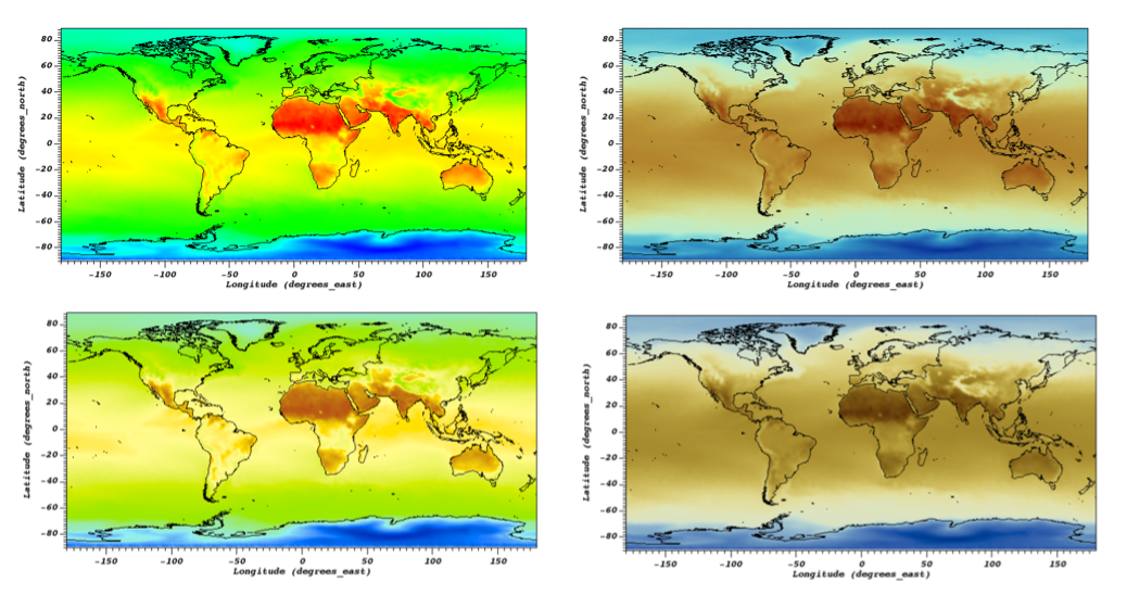
VisIt was originally released in 2002 with a handful of immutable color maps. Developers soon recognized that the options were insufficient, so they added the ability to create, import, and export color maps. As a result, the number of color maps quickly increased until about 60 color tables (including the popular Viridis tables) came installed with VisIt. “To satisfy requests for more inclusive software design, our research led us to color tables that we could integrate into VisIt to improve various aspects of data analysis in scientific visualization,” states VisIt computer scientist Mark Miller.
Improving the color mapping options created a usability problem. Initially, these color maps were listed alphabetically, which, although logical, proved difficult for users looking to find a color table of interest. So, the team split the tables into two categories: Standard and CVD Friendly. But even with this organization, the categories were large, and finding a specific color table required a significant amount of scrolling.
Once the VisIt team added Crameri tables—a slew of color maps specifically engineered for various scientific visualization tasks including supporting CVD users, the number of tables grew to over 300. All color table selection buttons, when clicked, displayed all the color tables at once in a massive popup box that covered the screen. A new mechanism for organization and searchability was needed. The developers opted to address three core requirements:
- Filter the list of color maps based on user-defined attributes (e.g., tags)
- Simplify finding specific color maps
- Easily discover color maps that may be well-suited to specific visualization tasks
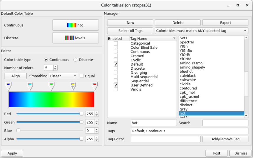
The solution to (1) and (3) was to create a color table tagging system, where each color table has one or more tags associated with it, and each tag indicates a specific property of a color table. For example, the tag Color Blind Safe indicates that the color table is appropriate for use with people with CVD. In an upcoming release, the default VisIt installation will present users with only 37 color tables that have been given the Default tag. Color tables were given this tag because they represent what most users are accustomed to seeing in VisIt’s interface. For additional flexibility, users can curate custom collections of color tables by creating new tags and attaching them to color tables.
The team also added a color table search feature to address (2). Search results show only the color tables whose names partially match the search string, making it easier to find a specific color table if the user is not entirely sure of the table(s) or tag(s) they want. This feature can be used in concert with the tagging system, allowing users to further refine the list of color tables.
The suite of color usability upgrades include options for applying tag filters; the ability to edit, add, and remove tags from color tables; and the capability to save the current filtering selection and tag changes when saving VisIt settings or sessions. Information on each feature and more can be found in VisIt’s documentation on color tables, and a tutorial using magnetic resonance imaging data includes an example of how to change a visualization’s color table.
Continuous Improvement
Part of the reason VisIt has endured for more than two decades is the team’s thoughtful evaluation of features and processes that can be improved. “Regardless of how mature a project is, there’s no end to challenging problems to solve or software engineering hurdles to overcome,” says Miller.
VisIt software engineer Justin Privitera points out that integrating color tables and developing a tagging infrastructure were iterative efforts. “Behind the scenes, the team discussed feature ideas, and over a period of many months, the system evolved into what it is today,” he explains. “Originally, tagging was an option users could enable. Choices to deprecate the categories system and put tagging front and center were made as we went along.”
The experience of color usability in Visit demonstrates that software roadmaps can’t always be fully planned, and a project plan needs to be flexible for unexpected situations. Project leader Eric Brugger points out, “Although the implementation of these features represents significantly more work than initially planned, the result was a powerful new capability for all users.”
—The VisIt team with Holly Auten